NEFERTUM
August - October 2024
OVERVIEW
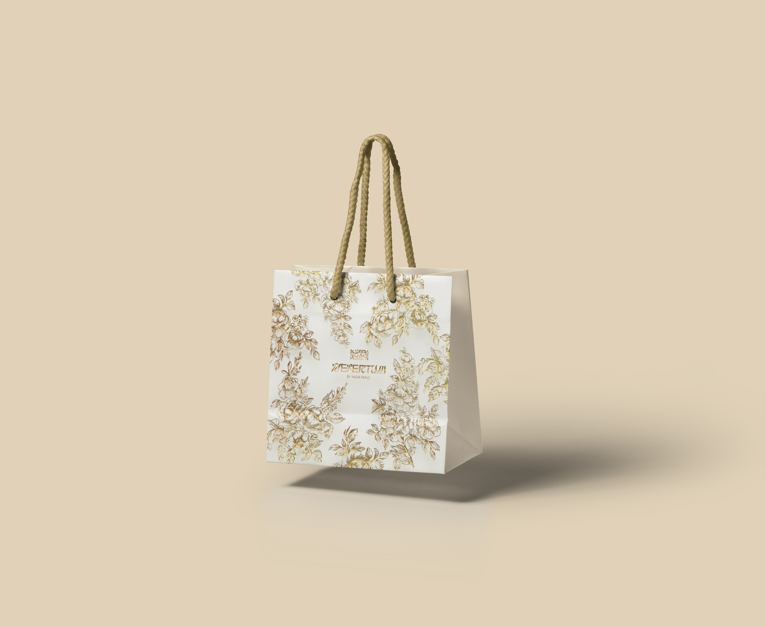
Nefertum is a luxury perfume brand inspired by the ancient God of Perfume, "Nefertum." The brand embodies a timeless elegance, blending gold accents with bright, playful colors. Floral elements are woven throughout the design, reflecting the client's vision of a sophisticated yet vibrant aesthetic.
MY ROLE
I led the creative direction for a luxury perfume brand, managing every aspect of the brand identity from concept to execution. I worked closely with the client to develop a completely new vision, designing custom perfume bottles and packaging for six distinct scents, each with its own tailored branding. I spent time researching the market and competitors to ensure the designs were both visually appealing and strategically positioned.
The client wasn’t satisfied with their previous logo, so I reimagined it by combining modern elements with the ancient theme they valued, making sure it was timeless yet contemporary.
Throughout the project, I focused on balancing aesthetics with functionality, ensuring that each design was not only beautiful but also practical for production. The final outcome was a visually cohesive, elevated brand identity that captured the client's vision and helped set the brand apart in a competitive market.
TOOLS
Procreate
Adobe Illustrator
Adobe Photoshop
WORK
Prototyping
Packaging Design
Logo Design
Brand Identity
Marketing Collateral
Branding
BRAND REFRESH, LOGO REDESIGN, COLOR PALETTE, PATTERNS, MOCKUPS
LOGO REDESIGN:
The client wanted a complete brand refresh, starting with the logo. I redesigned it to achieve a more balanced, refined look, featuring custom typography and a monogram-based symbol. The new logo exudes sophistication, blending a timeless gold theme with bold, eye-catching text that enhances the brand’s elegance and visual appeal.
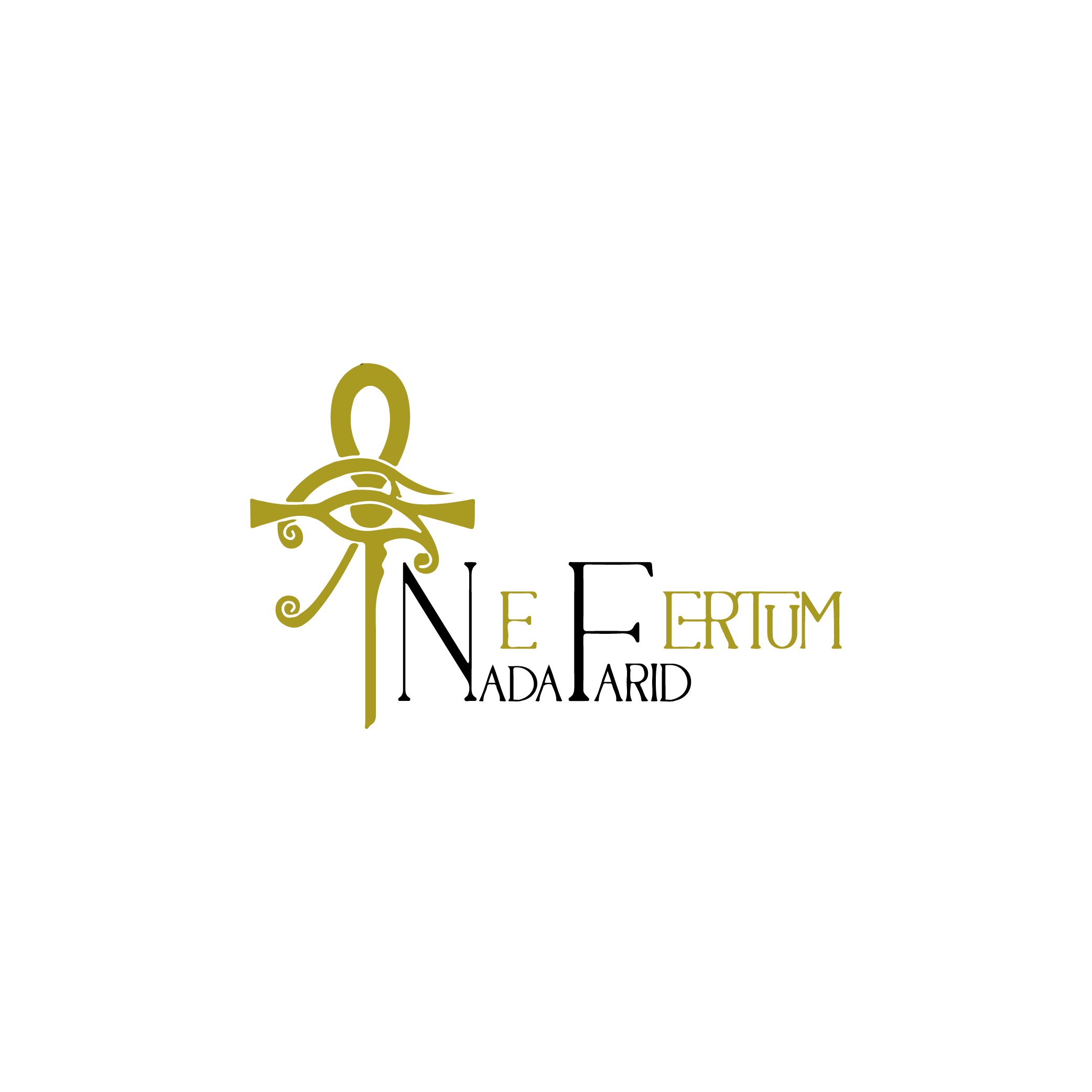
Previous Logo: The imbalance of text sizing as well as spacing in the logo created some legibility issues, making the logo feel disjointed and the brand name, "Nefertum," difficult to read at first glance. The visual weight created by the Eye of Horus and Ankh symbol distracted from the logo itself and emphasized the symbol over the text. Although the client was aiming to reinforce the letters "N" and "F" (her initials), the alternating black and gold did not reflect a cohesive look overall. Additionally, while the client preferred using gold in the logo, the exact shade used was a bit dull and did not convey the luxury that the client was aiming for.

New Logo: To highlight the connection between an ancient theme and a modern aesthetic, the updated logo features unique letter stylization paired with a clean sans serif typeface. The symbol, derived from the monogram "NF," represents both the client's initials and the brand name "Nefertum." By balancing larger text with a smaller symbol, the design achieves greater symmetry, placing emphasis on the brand name. The use of reflective gold in the logo preserves the client’s desired color palette while effectively conveying the luxury and elegance of the brand.
VISUAL IDENTITY:
For the rebrand, I chose a floral-inspired color palette that reflects the natural essence of the scents, particularly drawing from flowers. The colors—soft pinks, greens, corals, and creams—were selected to mirror petals, leaves, and stems found in nature, bringing a sense of life and vibrancy to the brand. I felt this palette lifted the overall visual identity, giving it a fresh feel. By incorporating the brand’s monogram into patterns, I aimed to create an timeless aesthetic that complemented the branding.

Packaging
perfume bottle prototyping, packaging boxes, gift bag, cards
Perfume Bottle
The client wanted a unique perfume bottle that would resonate with her audience, focusing heavily on creating eye-catching packaging. She envisioned a design that would be both attention-grabbing and elegant, something beautiful enough to display on a vanity. After exploring several sketches and label options, we chose a floral pattern wrapping around the bottle with the brand logo in the center, letting the design speak for itself before the scent. To maintain the theme of gold and sophistication, we wrapped the entire design in reflective gold foil with a matching gold cap.

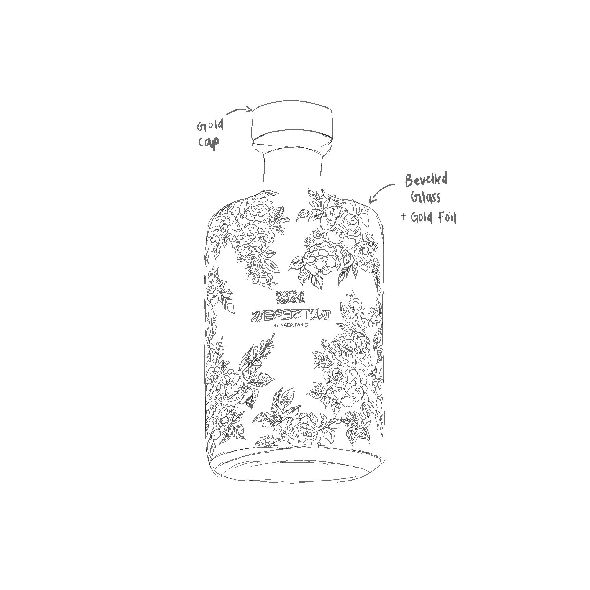
The initial prototyping of the bottle design. Sketched in Procreate.

The final rendering of the bottle design. Designed in Adobe Photoshop.
Box Packaging
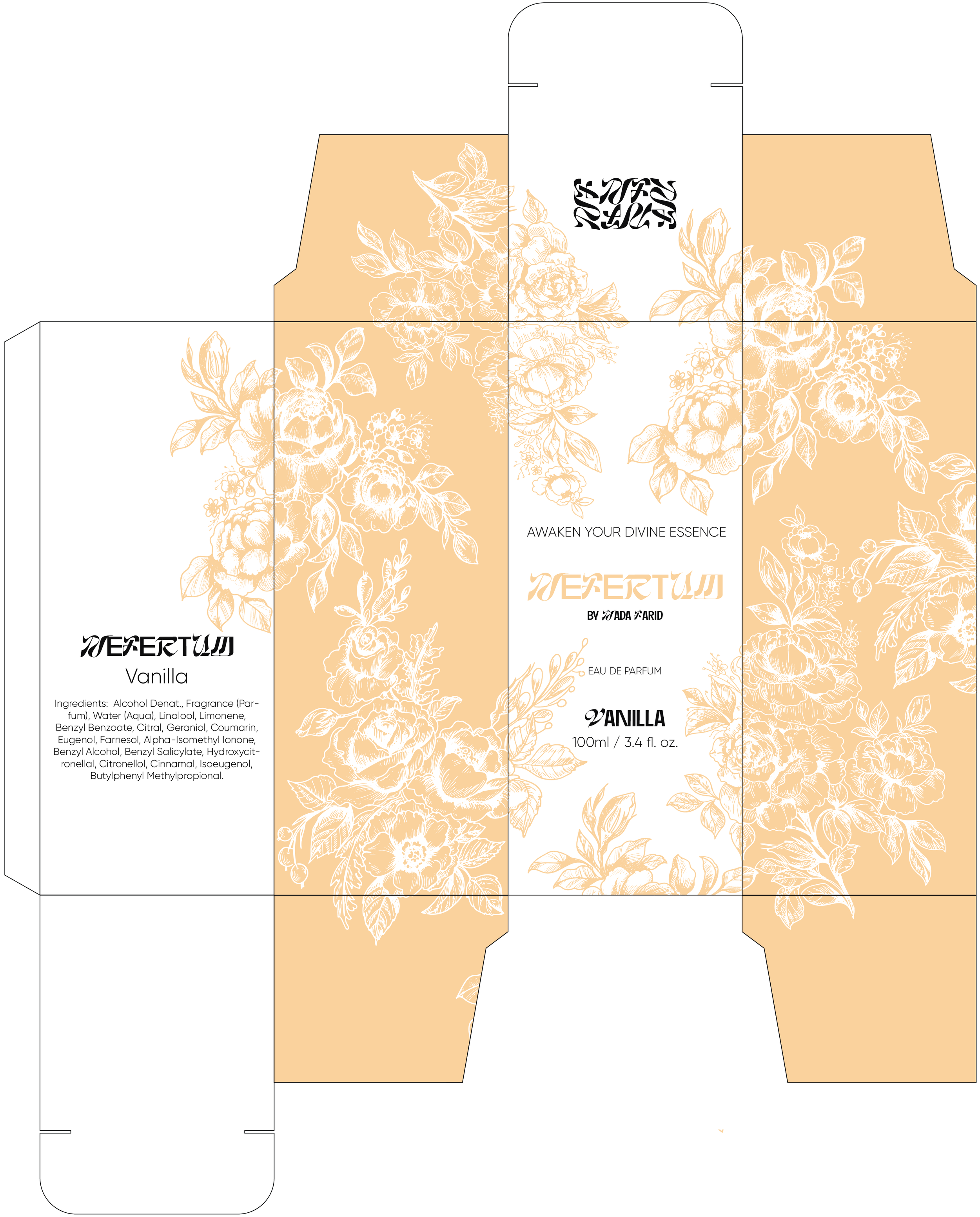
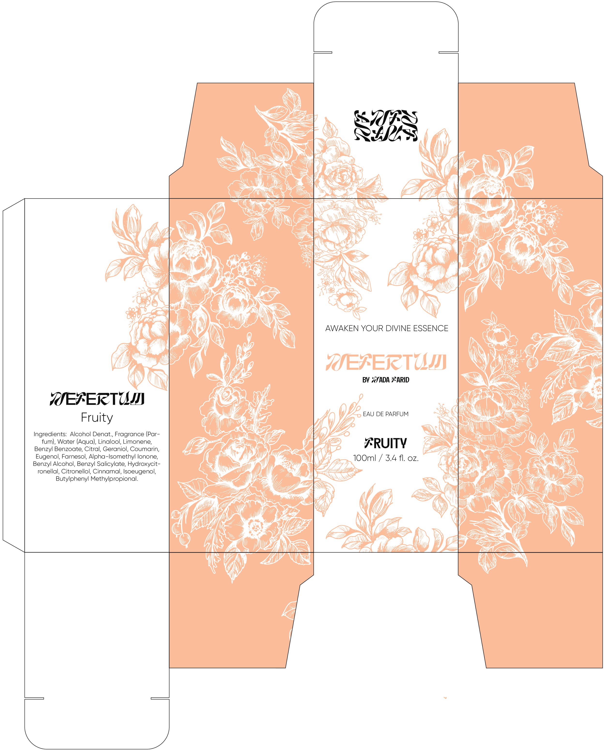
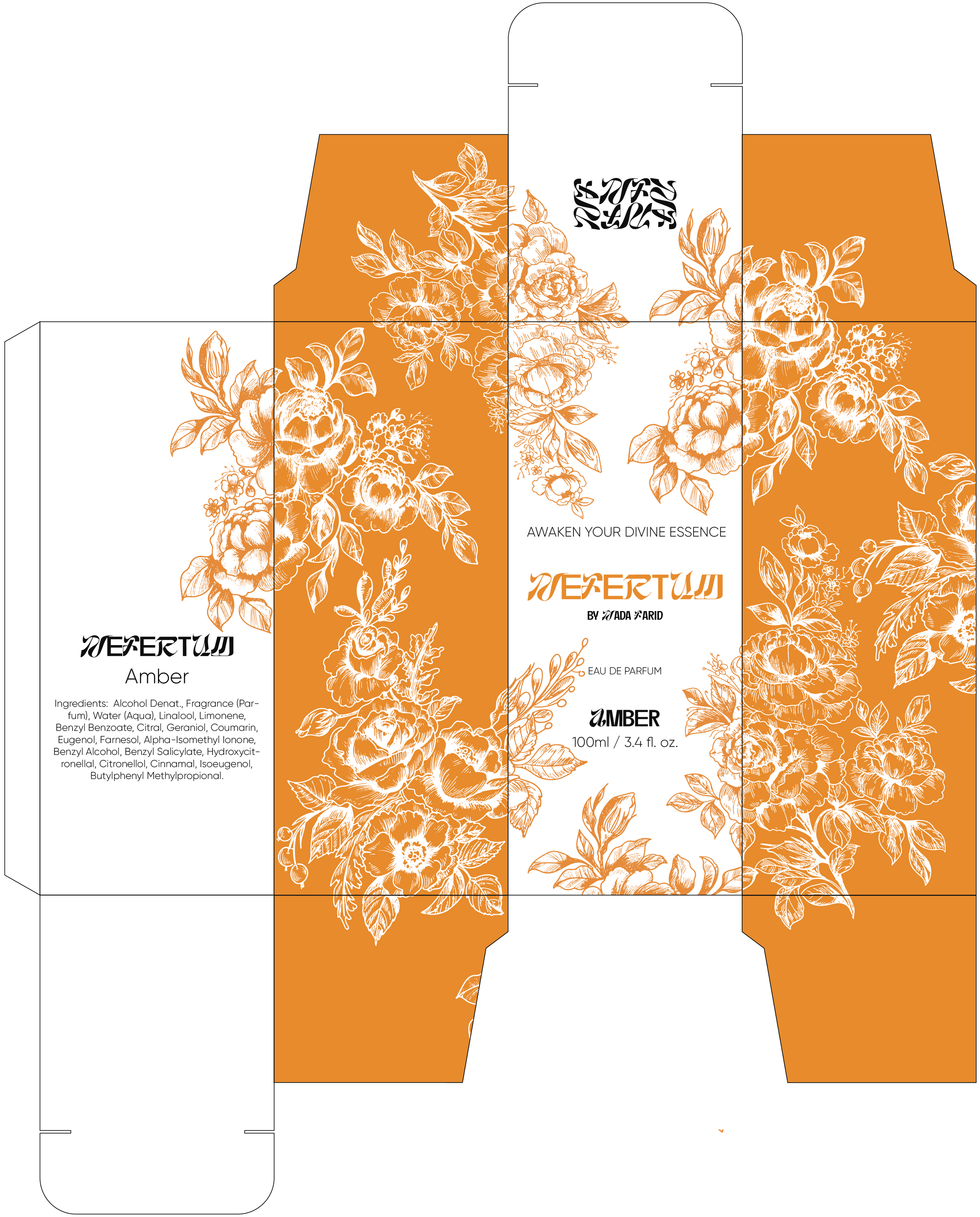
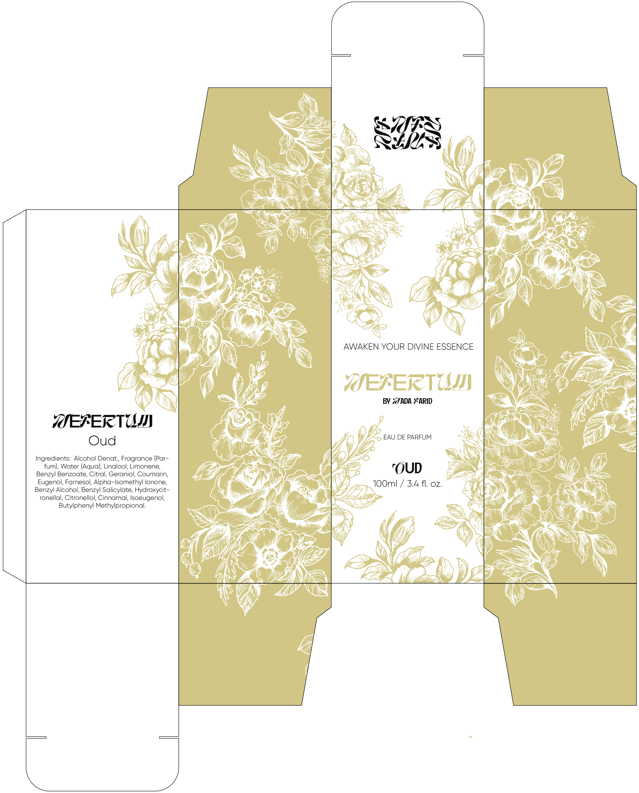
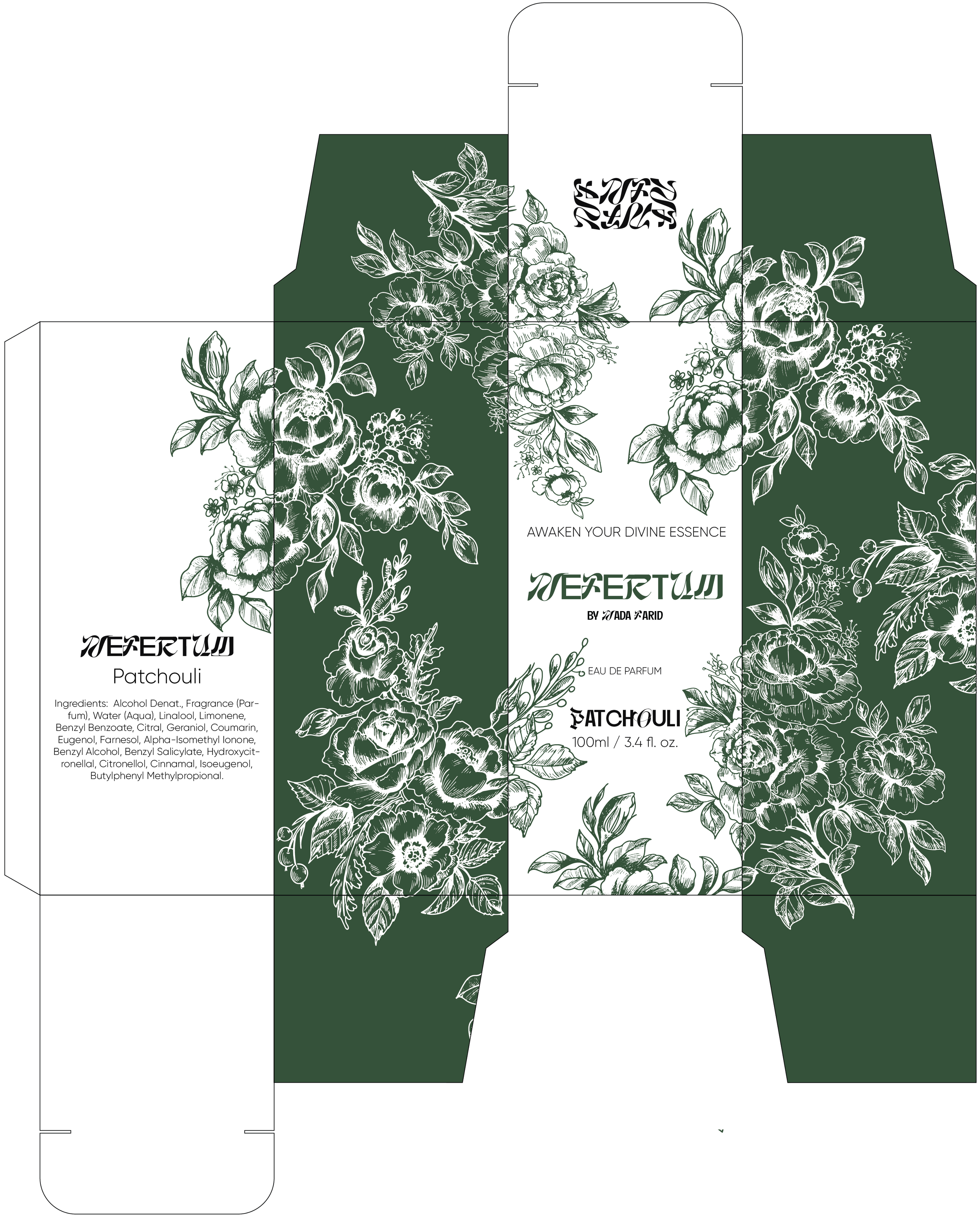
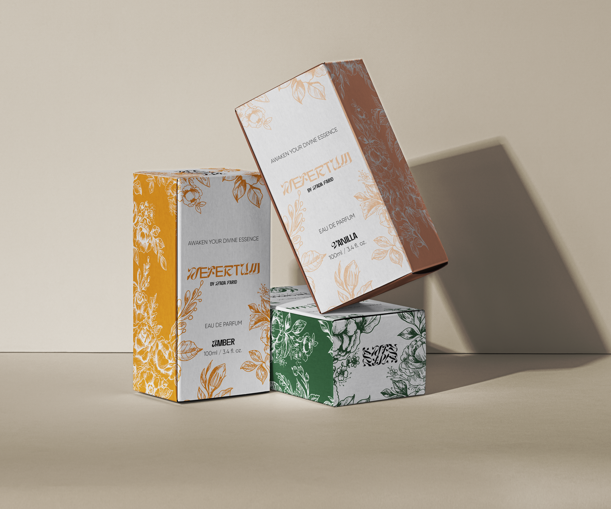
For the box packaging, I designed around six scent profiles: vanilla, patchouli, amber, fruity, floral, and oud. Each scent was paired with a specific color that guided the overall packaging design. I incorporated the same floral pattern from the bottle to maintain consistency, wrapping the boxes in it for a cohesive look. I chose the colors and floral patterns to reflect the essence of each scent, creating a visual connection between the packaging and the fragrance. The goal was to evoke the mood and character of each scent profile through both color and design.
