Language Learning Lab
2020 - 2021
OVERVIEW
The Language Learning Lab at UC Davis studies and explores the mechanisms that support early language learning in infants such as recognizing and identifying words. The lab also focuses on running studies that help measure statistical learning and vocabulary acquisition.
MY ROLE
As a research assistant, I worked closely with the Parent Infant Protocol (Pip) team to code audio recordings for target words (ex: cat, hat, boat) and vowels in those words. By isolating crucial segments of the audio, we were able to hypothesize the roles of pitch variation in vocabulary development and contribute to overall research towards early language development in infants.
As Media Manager, I was able to rebrand the lab, redesign their logo and website, and begin their social media journey. Adopting a new color scheme and vibrant art style, I designed multiple layouts for our Instagram feed. I used a more minimalistic approach by including a lot of abstract shapes and curved lines to create clean and appealing designs.
TOOLS
Figma
Adobe Illustrator
Adobe Photoshop
Praat
WORK
Illustration
Layout Design
Brand Identity
Web Design
Data Coding
DIRECTION
Problem: One of the main things that stood out to me was that the lab had very inconsistent style and brand image. The lab caters to parents and students yet the brand did not embody a friendly and warm take. The old logo meant to capture the UC Davis colors (navy + gold) and reflect the horse mascot of the university. The text was dull and thus not very attention-grabbing.
Solution: In attempt to embody the amicable nature of our baby lab, I created a new color palette that would guide the brand through the website and social media. While still retaining the UC Davis navy, I weaved in a couple fun pastels to uplift the brand. I also kept the image of the horse and used it in the negative space found in the second 'a' letter.
color palette
New Color Palette - These colors were a lot more vibrant and playful, thus relaying our friendly and welcoming approach.

logo
After - New logo, clean and concise, a lot less white space + more playful colors.
Before - Old logo, too simple and accompanied by a great amount of white space.

Social Media - Instagram
Our main goal when creating our instagram feed was to showcase the lab in a more approachable and exciting way for both parents and students. By introducing our staff and having weekly, story takeovers, we were able to convey the more welcoming and compassionate side of a lab, appealing to our undergraduate students. Likewise, by introducing our data and explaining how our studies are conducted in an easy, safe, and understandable way, we hope to reach more parents.
posts
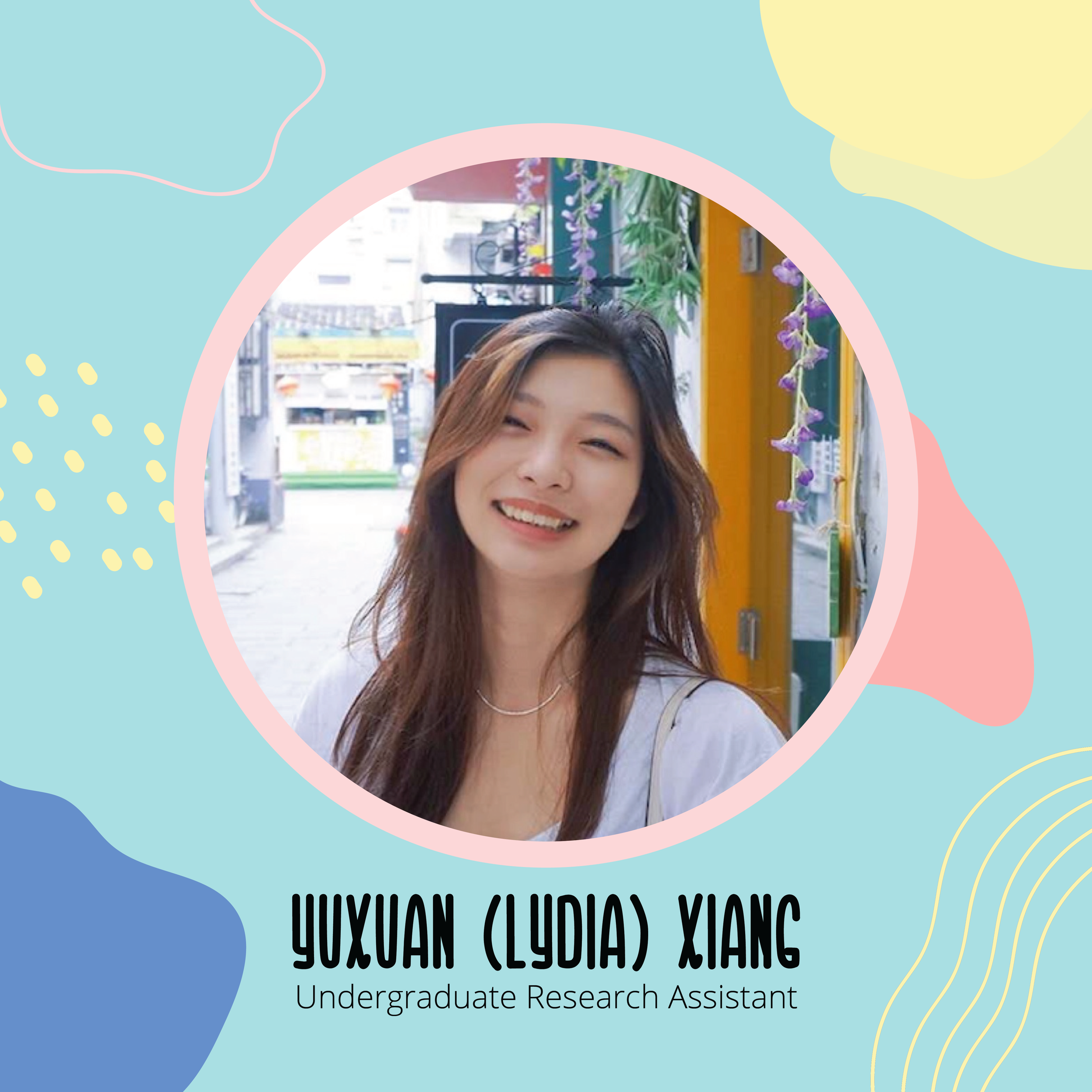
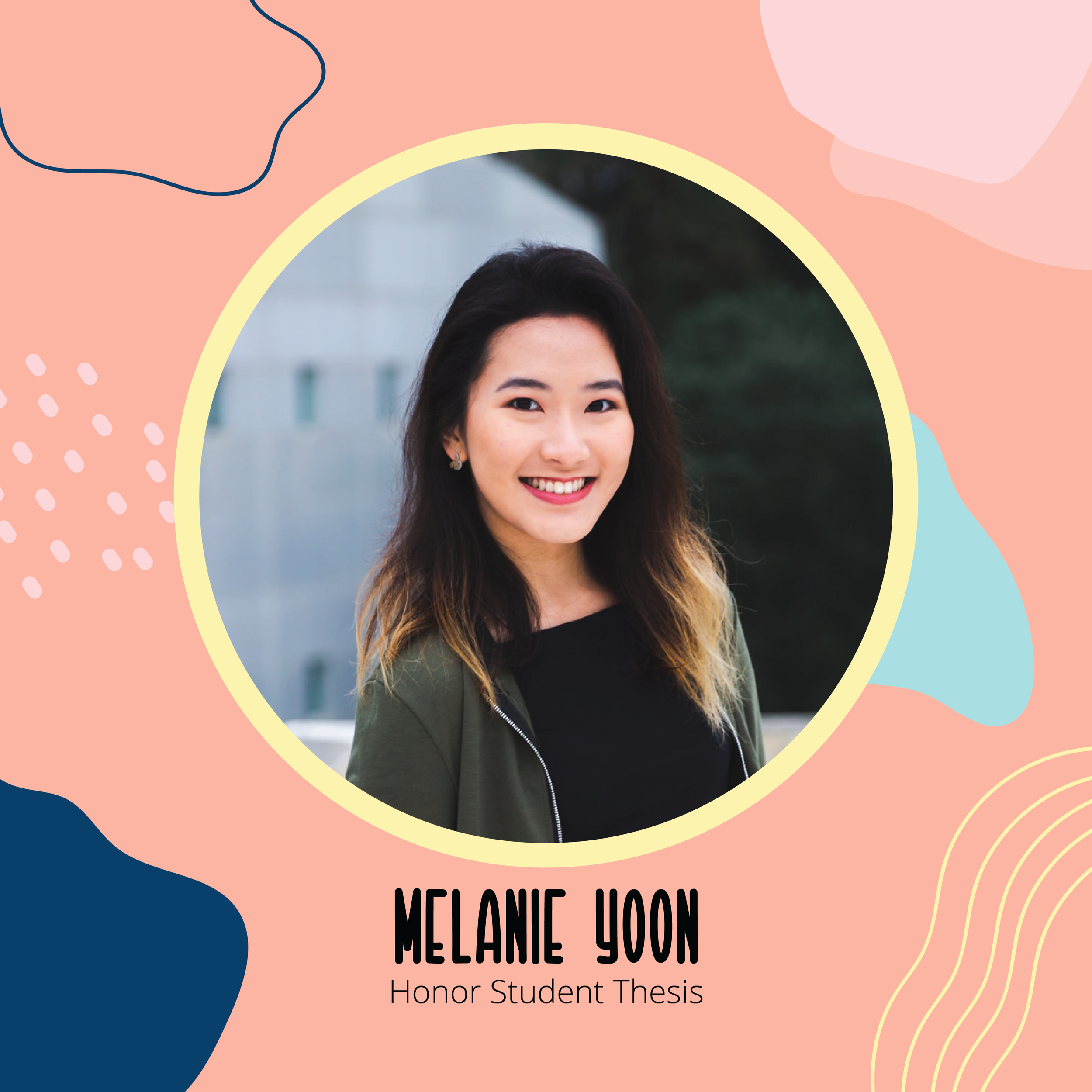
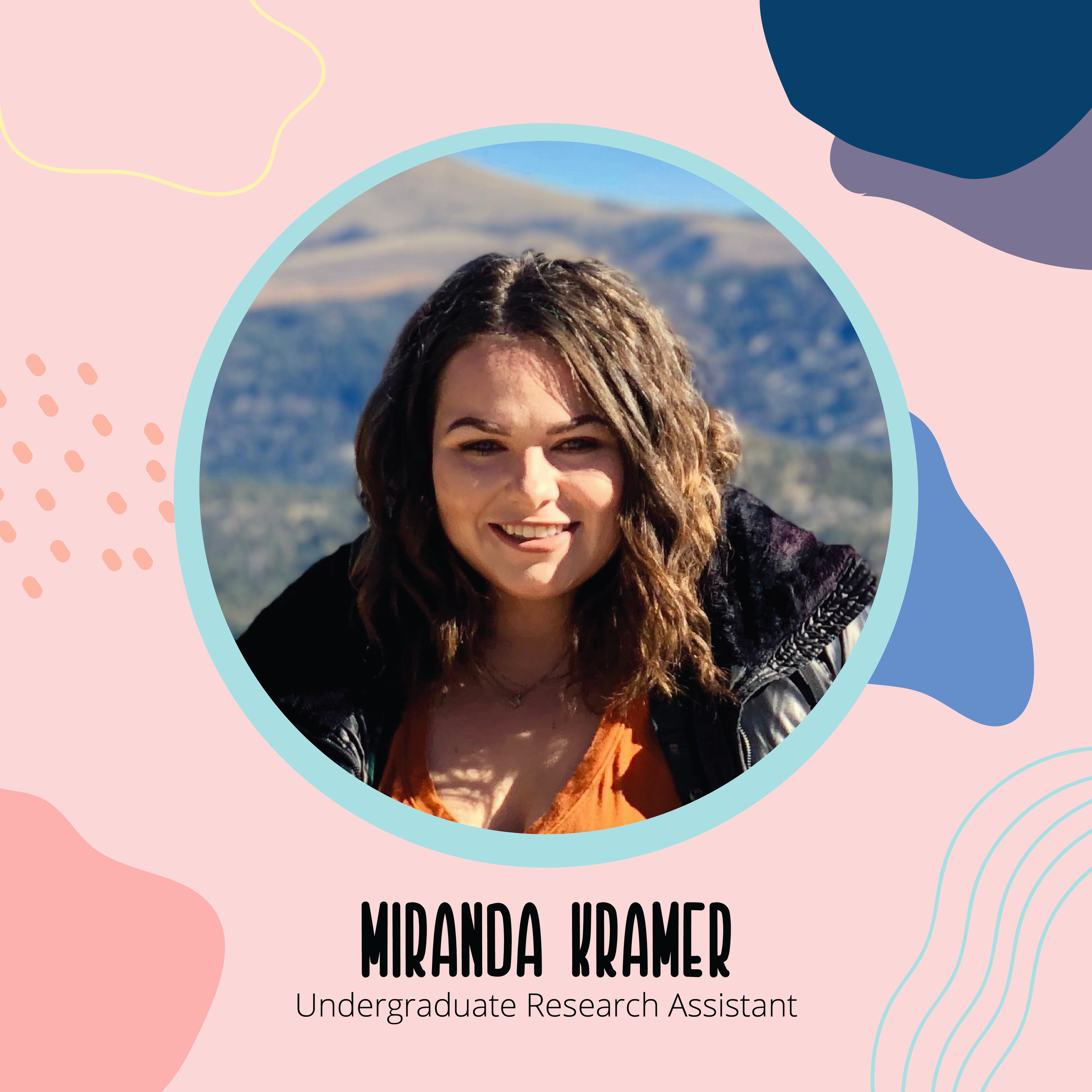
Implementing the fun color scheme, I designed engaging layouts to help introduce our lovely staff.

stories
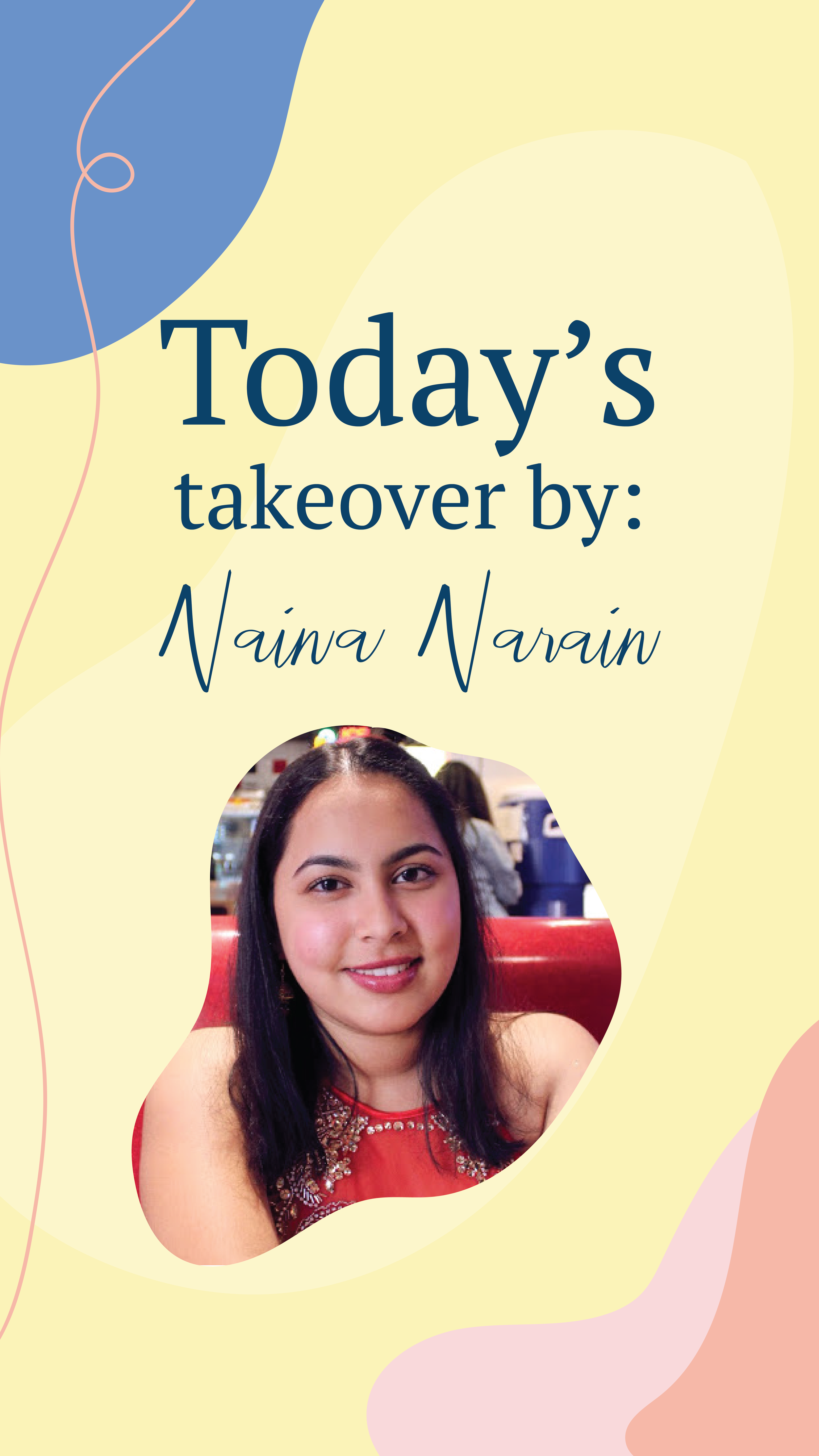
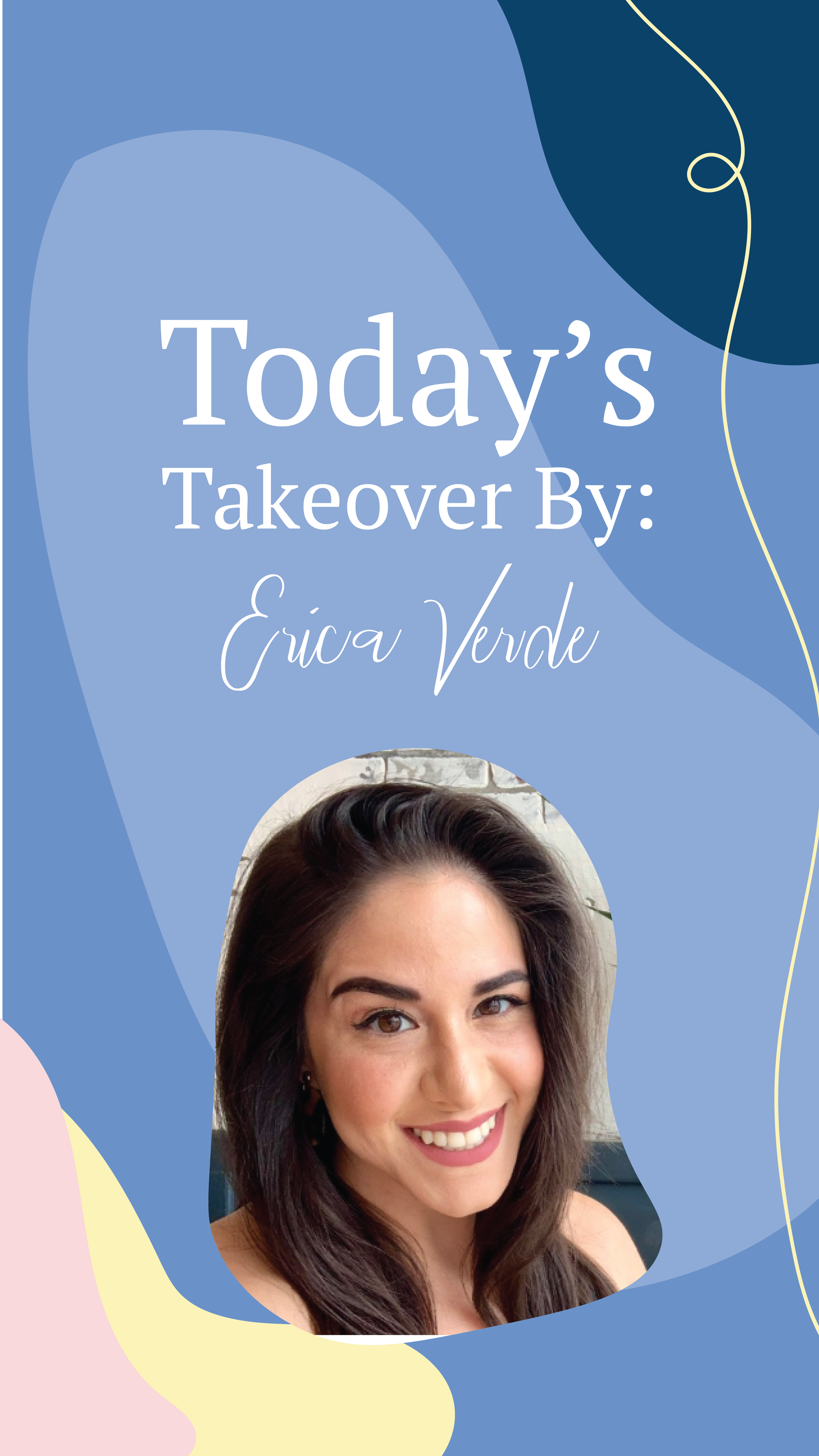
I designed an introduction slide on our stories to help our followers navigate the information in our new story highlight. It was meant to appeal to our student followers to learn more about our lab members, the work we do, as well as our approachable personalities and hobbies. The second slide was meant to introduce the lab member that was doing the takeover on that day.

Highlight Covers
I really wanted to include other elements that reflect the fact that we are a baby lab so I designed these cute and simple highlight covers to give our instagram page a more consistent and creative look.

Website Redesign
The previous website design was very heavy with text and photos and incredibly overwhelming to look at. There was no consistent style with the layouts, text, and fonts, making it harder for the users to find what they want in an easy and timely manner. The colors were bleak and faded and failed to show character to the lab.
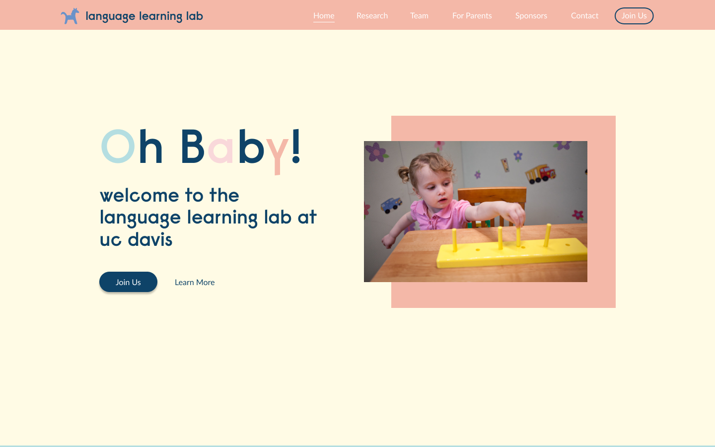
Through Figma, I was able to design exactly how I wanted the redesigned website to look. Using a catchy phrase on the landing page, I hoped to engage the user immediately and indicate subtly what the lab is for—babies!

I used these rectangles to transition from one section to the next so the user knows what to expect with the upcoming section.
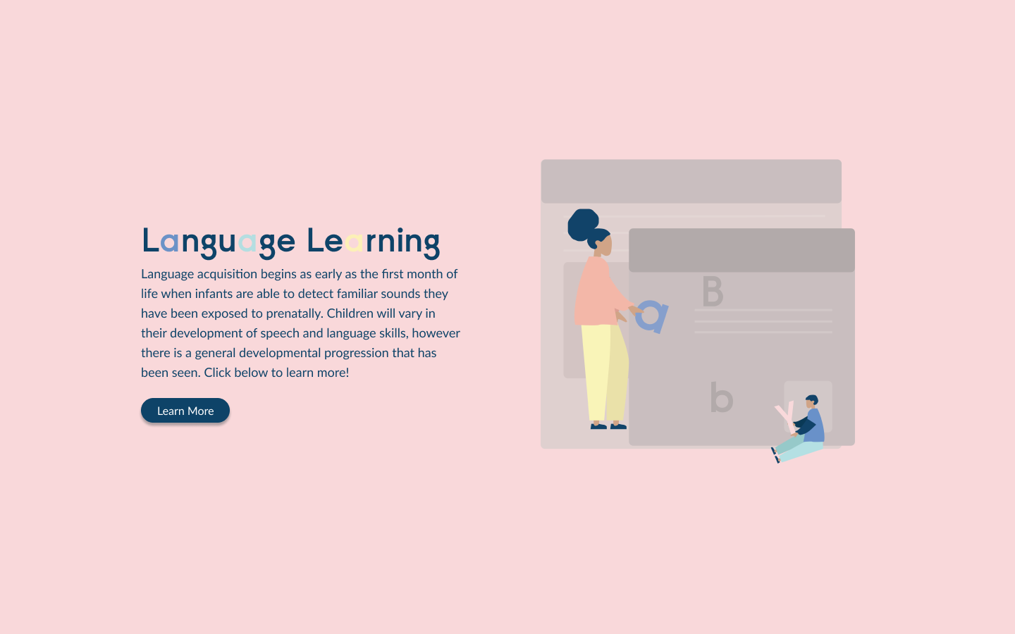
For all the website illustrations, I took inspiration from the "Humaaans" illustrations and designed figures to fit exactly where I needed them. To accompany this section explaining what language learning is, I created an adult and "baby" using letters to make up a word.

For this illustration, I recreated our discord channel where we regularly communicate with all our staff regarding the lab. I used the illustrations to indicate that we work virtually by drawing laptops with our logo on them.
